Is that good, did you clean your room? Do you want another graph story ? Okay, here’s the one about the abominable control chart. Simpler, shorter, you’ll get to bed quickly. I promised you I’d tell you this one. It’s really just to make you happy pfff but this one won’t get you excited. Well you know, your marble game, the variation you call the “wall”. You have to throw the marbles as close to the wall as possible but they must not touch the wall.
Rules of the marble game called “wall”
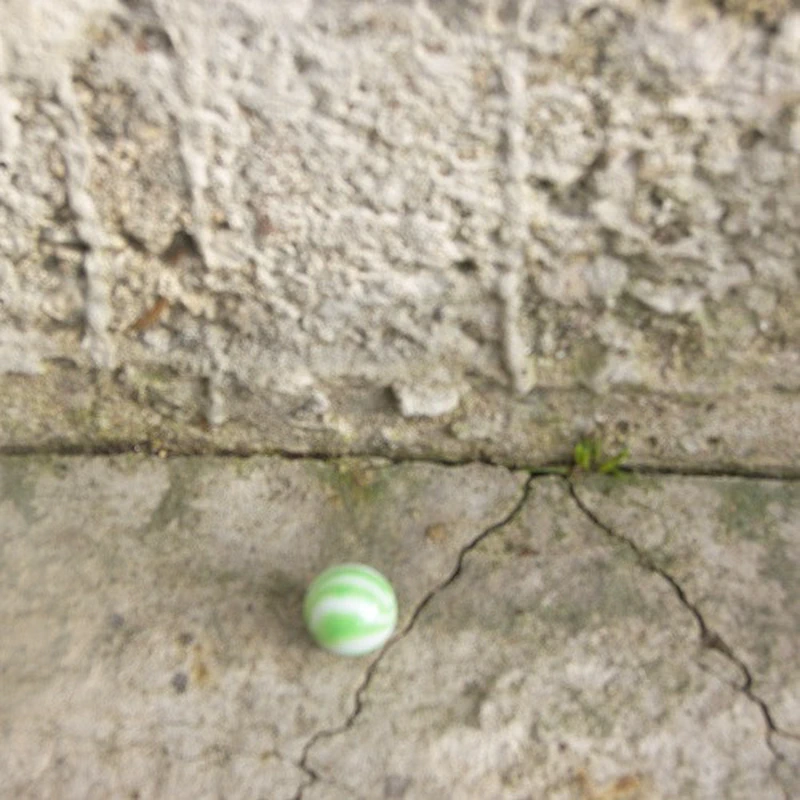
Look, on your marble bag it says: For this rule you must stand 3 meters from a wall or a line drawn on the ground with chalk. Each player must throw their marble toward the wall but be careful it must not touch it or you lose. The player who places their marble closest to the wall wins.
Do you play “wall”?
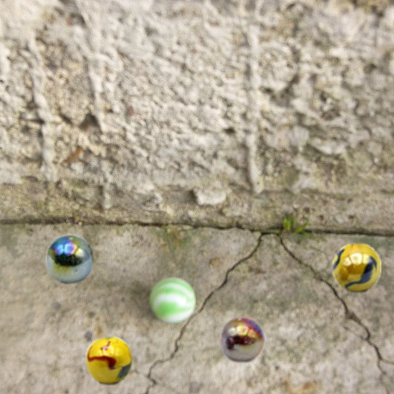
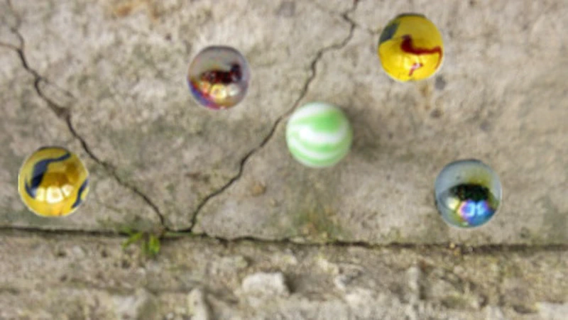
Do you play “wall” with your marbles at recess? Yes. Good, that’ll help me. So imagine several marbles near the wall.
And then whoosh! As if by magic we look at it in a mirror. The wall line is now at the bottom. But it’s still the same thing, like in your game, the farther the marbles are from the wall, the worse it is. This is so you understand the visual impression you should be looking for when looking at this graph. How many marbles? Are they close to the wall or far ? One last thing: imagine you throw one marble per day and each time you shift a few centimeters to the right. You can thus measure your progress, or not, day after day.
The questions you’ll ask yourself
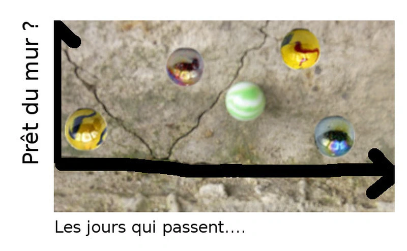
The questions you’ll naturally ask yourself: am I progressing? That is, are my marbles getting closer and closer to the wall? Am I consistent? Do I have different results depending on the type of marbles? Can I deduce my average skill from this? Can I hit my marble or what.
With the quirky people who work with me

With the quirky people who work with me, this is what it looks like. You can click on the image. And if you want to impress uncle Julien you can even use the excel file. I don’t know how others do it. But you simply scroll through the bottom line, the “wall” one in my example, as the days pass. And when you throw a marble, you note how many centimeters away it landed. Or here, the number of days it took for an activity to be completely done from its start to the end. The time it took from what you consider the beginning (when you have the idea? When you really start?) until what you consider the end (when others benefit from your idea? When your idea is ready? Interesting questions, no?).
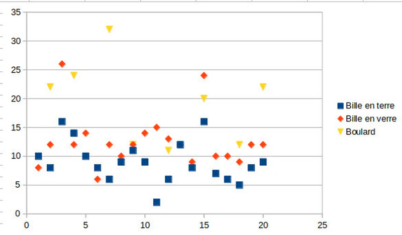
You see, I also estimated in my example that three elements could be thrown, or finished, on the same day, and I had fun saying that one was a glass marble, another clay, and some boulards, but they don’t arrive every day. Well we see there are fewer boulards than marbles, and that it’s harder: if I go back to the wall image your boulards are farther away, in my organizational examples this means that we generally took more time to do a boulard than a glass or clay marble. But you also see that generally speaking glass marbles take more time than clay marbles (more time to complete all activities from beginning to end). We see the average durations: marbles take between five and fifteen days. We see the accidents: What happened with the items on the third and fifteenth days? And that lost boulard on the seventh day? It’s important to analyze. Nothing happened precisely on those days, but those items took an abnormal time to be completed and this is visible at that moment (in the graph, earlier on the Kanban itself). Why?
Same thing, you’ll need to know why that clay marble was so fast (so close to the wall in my example) on the eleventh day. Was it really a marble? Did you move closer unintentionally?
If you keep this kind of table for your marble throws, you’ll maybe realize that from time to time when Johanna is watching your throws completely miss. Johanna affects you. You’d need to improve because it’s precisely for Johanna’s smile that you do this. For an organization if it knows how to limit these variations it will better predict what it’s capable of doing. Here it would say that on average an activity is completed from beginning to end in eight to ten days, with a minimum duration of five days and maximum of fifteen days. The rest being accidents to investigate.
What would progressing mean?
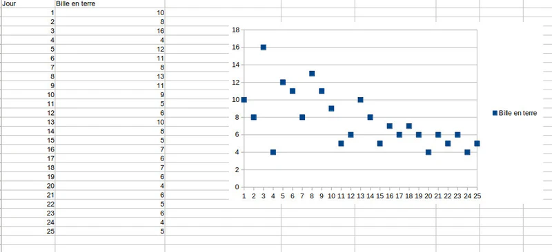
It would mean avoiding as much as possible unexpected and incomprehensible variations. It would be good that even in Johanna’s presence you know you’ll make a good marble throw, without being influenced.
It would mean reducing the range of possibilities: rather than having a possible variation between five and fifteen days: rather have it between seven and twelve days. For you it’s even more knowing in advance your marble throwing skill, knowing with more certainty that you’ll certainly be able to beat Geoffrey or William again. In these first two improvements: you give yourself more certainty about your capacity, less volatility.
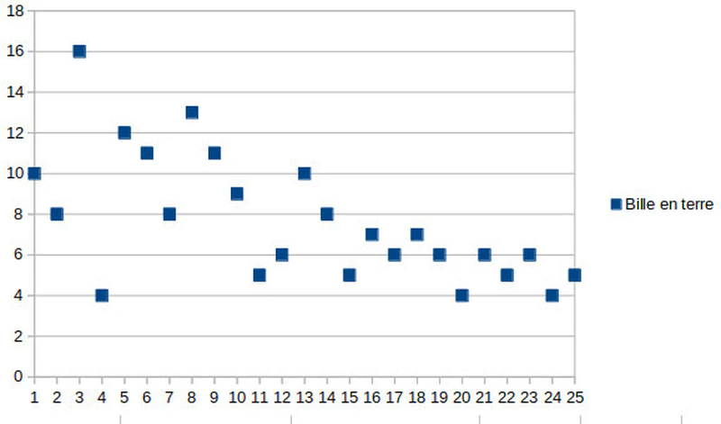
Finally, naturally it’s improving your performance: that is, achieving shorter times, moving the marbles closer to the wall.
The idea is that if your graph has points all over the place it’s like a shooter at the fair who would have riddled holes everywhere on their target: as much luck as chance. All the arrows or bullets of a good shooter would be near the center, grouped together. Same for you, if your graph is erratic, that is with points a bit everywhere without coherence, it’s that you’re not really disciplined in your mastery of the marble. After lunch, with Johanna’s smile, or when Quentin teases you, or even well concentrated facing Antoine: are you pretty sure of the result or can it go in all directions?
For you the graph shows if it goes in all directions or not, if you’ll know with enough certainty to impress Johanna or beat Geoffrey and William, and if over time you become more competent. For an organization it’s the same: is it disciplined or erratic ? Does it know with enough certainty the time each of its activities will take or is its volatility too great? Finally if it improves. How does this improvement happen? By collectively questioning how to improve (through retrospectives for example). With the integration of limits that can introduce a clearer strategy, and that can improve flow by pushing to stop starting things, to start finishing them. With pull flow management rather than push. All this is mentioned in the Kanban links below.
The rhythm around these graphs
Whether it’s the Cumulative Flow Diagram previously mentioned (link below) or the Control Chart the best thing is not to think and to start storing the numbers as soon as possible. Like flowers that bud, the diagrams will make sense over time. Like dough that rises: let it rest a while by storing the numbers. It’s after one or several months that your graphs make sense.
You like that I’m telling you not to think. But listen, and I’m not going to tell you this again anytime soon, often we think far too much before acting. Go on, go play before I think about it.