Today I was challenged to explain the two main Kanban diagrams to you as if you were children. Who hasn’t gotten lost in a Cumulative Flow Diagram or a Control Chart? Well, I’m saying this, but I studied Letters, Arts & Philosophy (and I worked on Monty Python), so don’t count on me to calculate a percentage! And yet I need them with these darn diagrams. So I thought to myself, try to explain it to a child, to use Einstein’s adage “If you can’t explain it to an 8-year-old child, it means you don’t know what you’re talking about.”
Once upon a time…
The terrible cumulative flow diagram
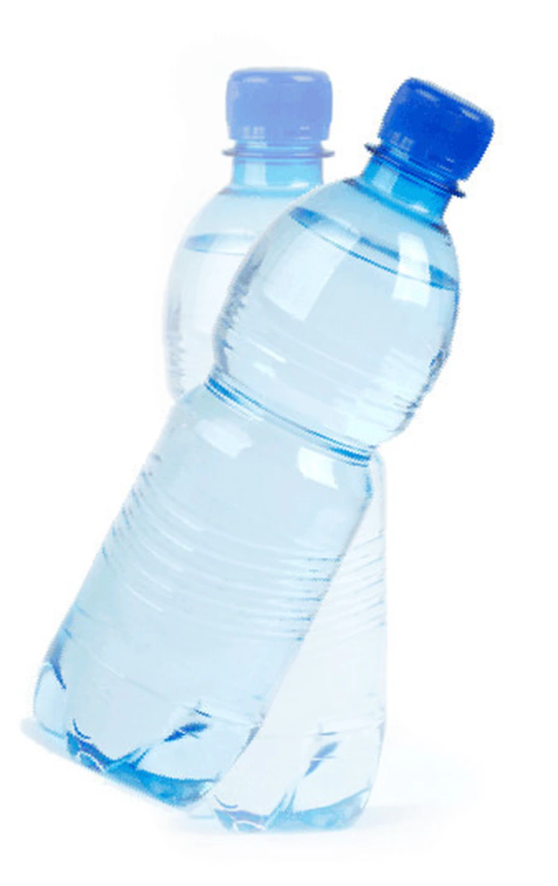
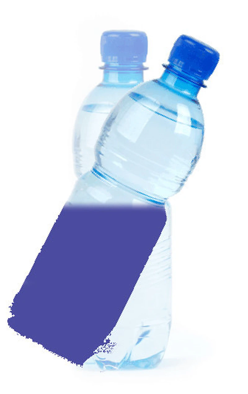
Listen, you have a tap of requests (which we hope have value), that fills a container, let’s say a bottle. But a tilted bottle. And so it fills up (the tap I mean).
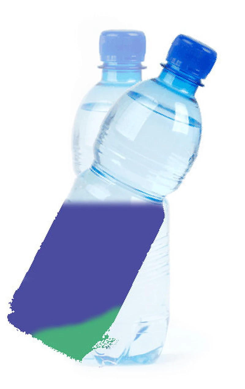

And then there’s a chemical reaction on these requests contained in this bottle. Little by little they move from one state to another and so they change colors, they transform. From blue they become green, but the chemical reaction continues: from green they become orange, then gray. And the process gains on the bottle, but requests continue to flow from the tap. It’s beautiful, isn’t it? A bit like your bottles of colored sand.
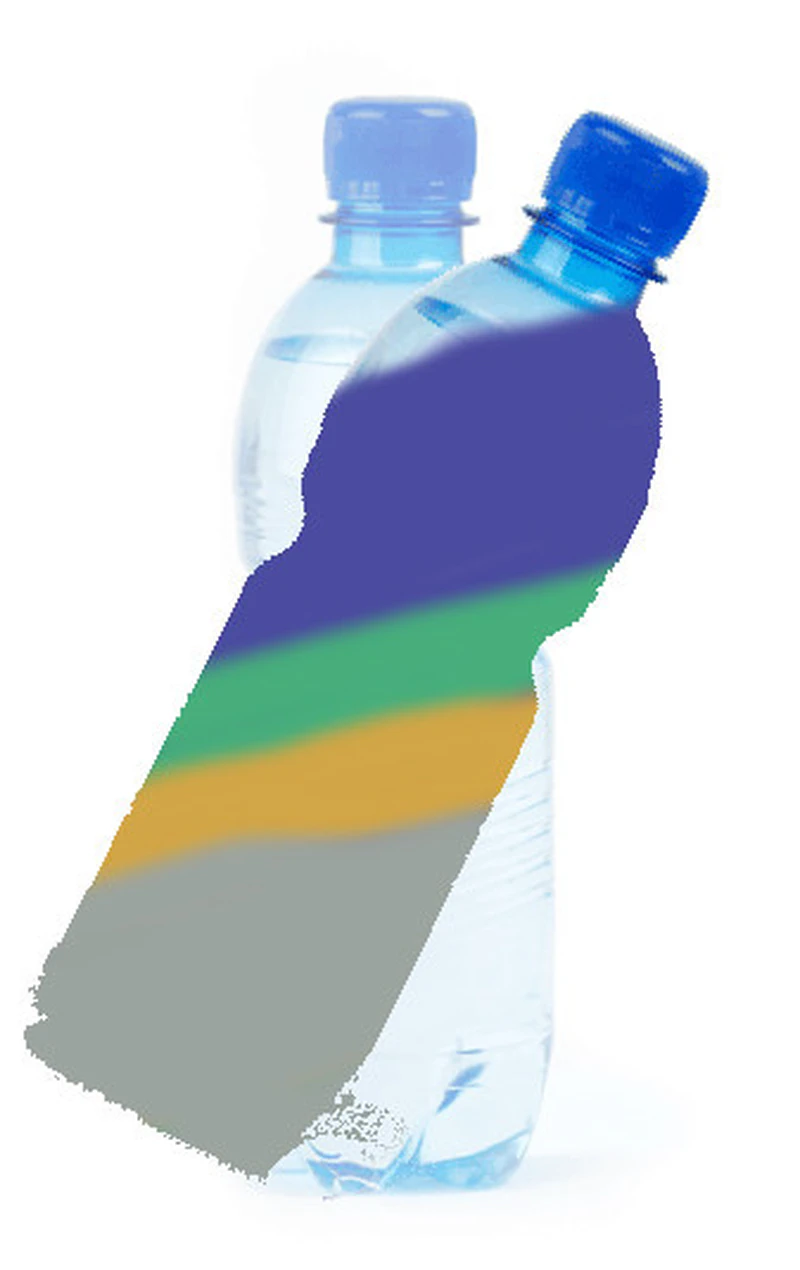
It could almost be like sedimentary rocks. What? Never mind you’ll see that in middle school.
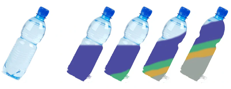
Finally if we had to look at this on a timeline, uh, if we had to look at the different states of the bottle over time we would see this (concentrate a bit and look at the drawing). We could count the requests that have flowed from the tap. We could accumulate them, add them up if you prefer. We first had 50, then 60 (in total), then let’s say 80. But out of these 80, at some point 15 became green. Then we had up to 90 requests, of which 20 were in the green state, and 10 went from green to orange. Then from orange they become gray, and since they don’t change anymore it accumulates, it settles at the bottom of the bottle in a final definitive state.

At the end we could imagine that we had 120 requests in total that have flowed, 10 that are still in a green state, 10 that are still in an orange state, and 60 in a gray state. If I’m counting correctly, you do math in 5th grade, right? If I’m counting correctly, there are therefore 40 requests that are still blue. This is a bit like what this last bottle could represent.
If I’m telling you all this, it’s to take an image, the different colors, the different stages, are the different moments of an activity. It could be important for you to know how many you have that are starting, how many you have that are finished, how many you have that are transforming. And the representation in the form of colors, and lines, could help you understand what’s happening.
Look, let’s imagine that your activity is “eating mom and dad’s cookies,” and the different stages of your activity: putting them in your bag and eating them. The elements flowing from the tap are mom and dad’s cookies (they’re indicated in blue). When you put them in your bag they become green, when you eat them they become orange, when they’ve been eaten they’re indicated in gray. But so mom and dad made 120 cookies, of which 10 are still in your bag, you’re eating 10, and you had already eaten 60. In real life as adults who have forgotten to really live say, we’re going to use graphs (sorts of computer drawings).

In a file like excel (this is completely unrealistic what parent would inflict an excel file on their eight-year-old child…). Click on the image to enlarge or open the linked file [file excel]. Look at the list of information: mom and dad make between 10 and 14 cookies per day (you have the line of days on the left, we’re observing the activity for 20 days), you put between 5 and 11 in your bag every day, you eat between 9 and 4 per day. But you manage to finish between 5 and 7 per day (I know it’s weird, let’s say you constantly have cookies in your mouth). But nice output. Yes I know, don’t get mad at me, I saw that the color codes between my bottle and my graph have nothing to do with each other.
You saw the columns: the deepest one, on the right, the first states, like the water that starts flowing in our bottle, or mom and dad making the cookies. Every day you note the number of requests that flow, the number of cookies made. 10 the first day, 12 the second day, etc. Then a more recent state, less deep, the number of cookies in your bag, same thing, just the sum per day, 0 the first day, they’re being made. Etc. On the last column concerning the cookies you accumulate, you add them up: it’s all the cookies you’ve eaten.
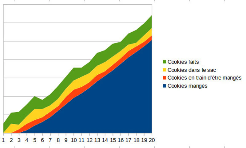
You saw in the leftmost column the timeline, the days going by. It’s a nice graph. In life adults can use it to see what’s happening when they’re not near you watching if you eat your cookies or not and at what rate.
Blockage, for 5 days you can’t swallow the cookies anymore!!

Imagine you stop swallowing the cookies??? You chew them endlessly and they accumulate because you keep taking them and putting them in your mouth from the tenth to the fifteenth day. On the fifteenth day you start swallowing again and you try to make up for this delay. You saw on the graph we see the pocket: your mouth that widens full of cookies. You store them in your cheeks, then start swallowing them again on the fifteenth day. You have the number of cookies being eaten that swells (like your cheeks), then shrinks again. Conversely the number of finished, eaten cookies doesn’t advance anymore from the tenth to the fifteenth day. And this is visible on the graph.

You can’t take cookies anymore, you stop eating them

…and you hide them in your bag. Imagine from the tenth day you decide to stop eating and to hide them in your bag. The cookies being eaten column therefore goes to zero, and the column that accumulates the cookies eaten stagnates, we’re adding zeros. But on the fifteenth day the bag can no longer contain additional cookies, the cookies therefore start to accumulate at mom and dad’s. On the graph it’s clear: the bag grows from the tenth day, nothing is eaten anymore: the blue curve is flat, and from the fifteenth day it’s the bag that can’t swallow anything anymore and becomes flat, we then see the mom and dad space growing. If mom and dad had looked at the graph they would have seen that you weren’t finishing your cookies anymore and could have stopped making them.
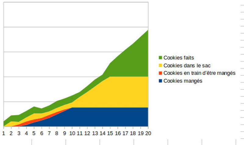
We’ve already understood an important thing: accumulation pockets are not great and so apart from the last column which is the accumulation of cookies eaten it’s rather a better sign to have a thin thickness, why? (I think that like with Hansel and Gretel I’ve lost the children…)
Two reading indicators of the evil cumulative flow diagram
The time to traverse different states, the “lead time”
It’s the time it takes for a cookie that has just been made by mom and dad to be eaten: it goes in the bag, in your mouth, then it’s finished, eaten.
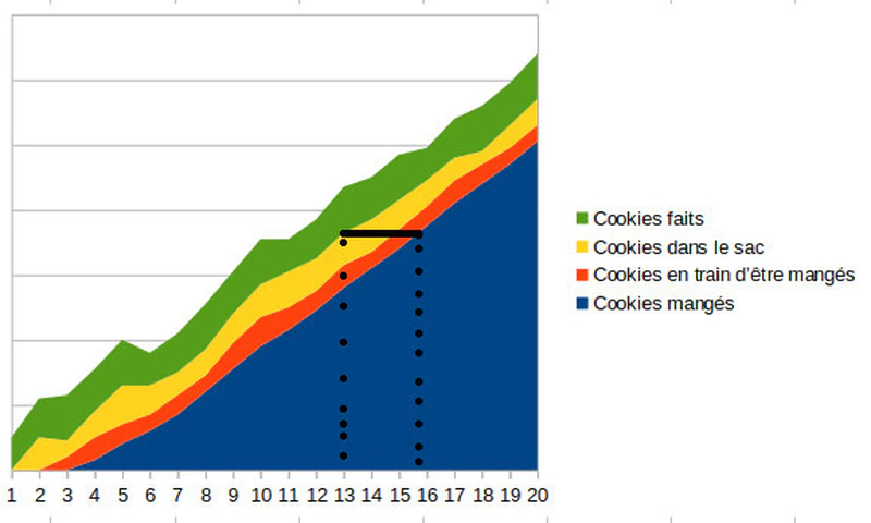
On the graph it’s easy I draw a horizontal line from the beginning of the in the bag color to the end of the being eaten color then I look at the number of days it took and I tell myself that the lead time is three days. (Don’t forget to click on the image if you want to enlarge, or eat more cookies that works too). It’s important, a cookie expires in 5 days, here they have a lifespan of 3 days, so I’m not worried about you.
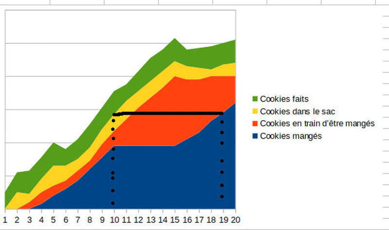
But here’s the scenario where you decided to stop swallowing cookies for five days! And here the lead time has become nine days! Normal you accumulated the cookies in your chubby cheeks you rascal. And here 9 days you could swallow slightly expired cookies…
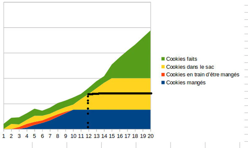
And here… well the lead time is infinite because I remind you that you stopped eating cookies, and that your bag then exploded. It’s visible isn’t it on the graph? It doesn’t advance anymore, it doesn’t go up anymore, it’s literally “flat”.
The “work in progress”
The number of cookies that are neither at mom & dad’s nor finished, those that are either in your bag, or in your mouth, in full activity. Easy you draw a line in the other direction, vertically from the top of the cookies in the bag line and at the bottom of cookies being eaten and you count.

Here on the tenth day we have a “work in progress”, the famous WIP, of 19. No need to count the cookies still at mom and dad’s, they’re not yet in our possession, nor those we’ve already eaten. But I realize that on the 19th day I have a smaller WIP of 12 cookies (which are either in my bag, or in my mouth).
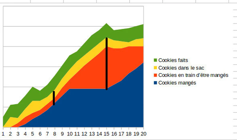
Here, during the so-called “cookie break” event, before, on the eighth day, I have a WIP of 13 cookies, but at the height of the crisis, on the fifteenth day I have a WIP of 51 cookies, including 42 in my chubby cheeks!
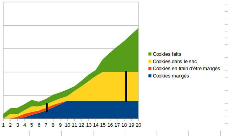
Here in complete disarray I have a WIP of 62 but since especially I have an infinite lead time, well I’m in trouble. Because indeed it’s the association of the WIP, work in progress and the lead time, that can give us indications of pace.
But what are we looking for?
We want fresh cookies
First we want fresh cookies. If the cookies have spent a long time in the bag, they won’t be good. In other contexts it’s also often the same thing, if a central line is too thick on the graph, it means that things are stagnating, and generally they expire. So apart from the accumulation at the bottom of the bottle we’d want not too thick lines concerning the activities.
We want to be able to change the flavor of cookies more often
Another advantage to having not too thick lines is that we can ask mom and dad to change the recipe and we don’t end up with a huge stock of chocolate cookies when we now want vanilla. If there’s one that we digest poorly we want to be able to quickly change the recipe and not find ourselves with lots of indigestible cookies on our hands. In short, here too it’s important to have fairly thin lines on the graph because they indicate little stock.
Little stock, little inertia allows me to have fresh cookies, up to date in a way, to easily welcome change (of recipe) and learnings (about your tolerance).
Next
Go clean your room and I’ll tell you one of these days about the abominable control chart!